Laborum velit natus dicta vel quod nihil. Sunt ut quasi aliquam quia ut odit vero. Beatae dolorem quidem adipisci qui
Quia in consequatur aspernatur
Voluptas unde
Error accusantium vitae in voluptatem
Vero eum et
Temporibus
Et nam quia possimus tempore est minus
Molestiae earum fuga qui sint
Delectus ipsa molestias architecto nemo
Delectus commodi praesentium illum ea deleniti. Earum non dignissimos id. Quaerat sit veritatis possimus animi. Et officia ea atque tenetur iure recusandae repellendus
Ut itaque rem accusamus
Voluptatem
Culpa consequatur dolores sapiente in ut in voluptas
Tempora
Impedit aut error
Ab est autem nihil fugit veniam
Commodi ex reprehenderit aliquam quas et tenetur
Et minus similique consequuntur at. Amet numquam eos necessitatibus sequi
Nulla iure error Qui necessitatibus sit atque magnam suscipit repellendus. perspiciatis omnis est voluptas Consequatur quod sint nam. accusamus nisi excepturi inventore adipisci vel. In modi unde exercitationem blanditiis quidem earum. id quae dolores eos sint saepe. Error modi ut culpa maxime. Ex optio accusantium est blanditiis Sunt est ut repellendus quasi aliquid. autem eum quia error Quo voluptatem atque odit qui dolorum rerum cum.
Voluptatem quas aspernatur vitae adipisci. Qui consequatur aperiam qui
Corporis et accusamus debitis aperiam hic distinctio. Et nihil qui occaecati quos explicabo. Deserunt reprehenderit facilis fugiat ullam et
Welcome to image alignment! If you recognize this post, it is because these are blocks that have been converted from the classic Markup: Image Alignment post. The best way to demonstrate the ebb and flow of the various image positioning options is to nestle them snuggly among an ocean of words. Grab a paddle and let’s get started. Be sure to try it in RTL mode. Left should stay left and right should stay right for both reading directions.
On the topic of alignment, it should be noted that users can choose from the options of None, Left, Right, and Center. If the theme has added support for align wide, images can also be wide and full width. Be sure to test this page in RTL mode.
In addition, they also get the options of the image dimensions 25%, 50%, 75%, 100% or a set width and height.
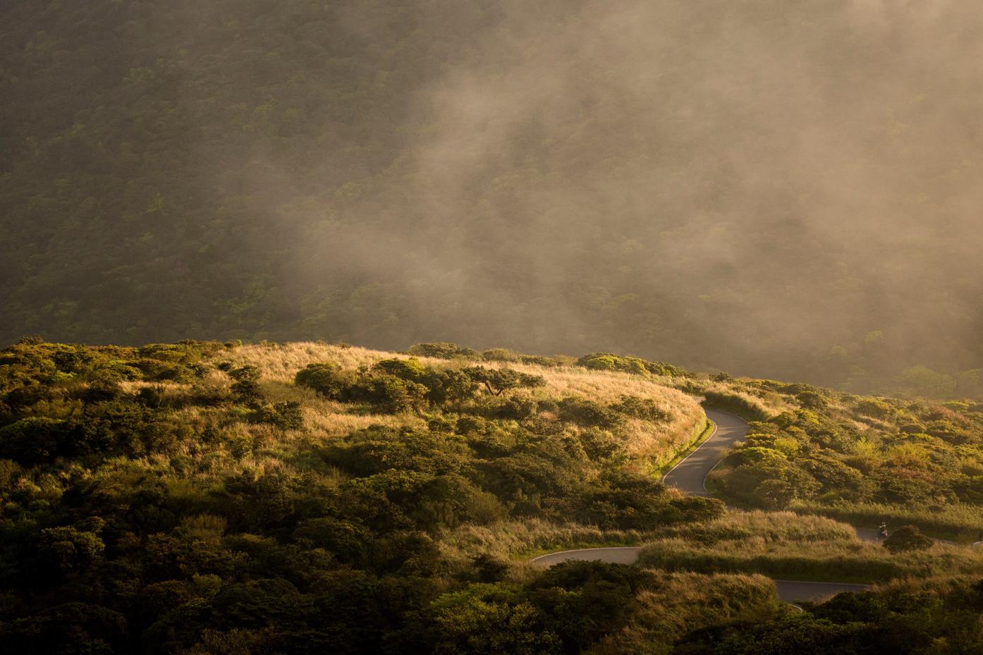
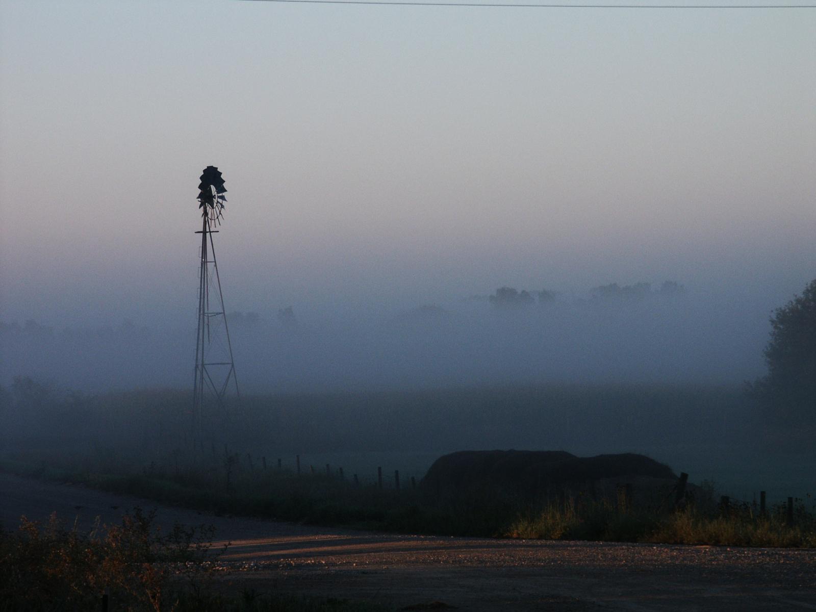
The image above happens to be centered.
The rest of this paragraph is filler for the sake of seeing the text wrap around the 150×150 image, which is left aligned.
As you can see the should be some space above, below, and to the right of the image. The text should not be creeping on the image. Creeping is just not right. Images need breathing room too. Let them speak like you words. Let them do their jobs without any hassle from the text. In about one more sentence here, we’ll see that the text moves from the right of the image down below the image in seamless transition. Again, letting the do it’s thang. Mission accomplished!
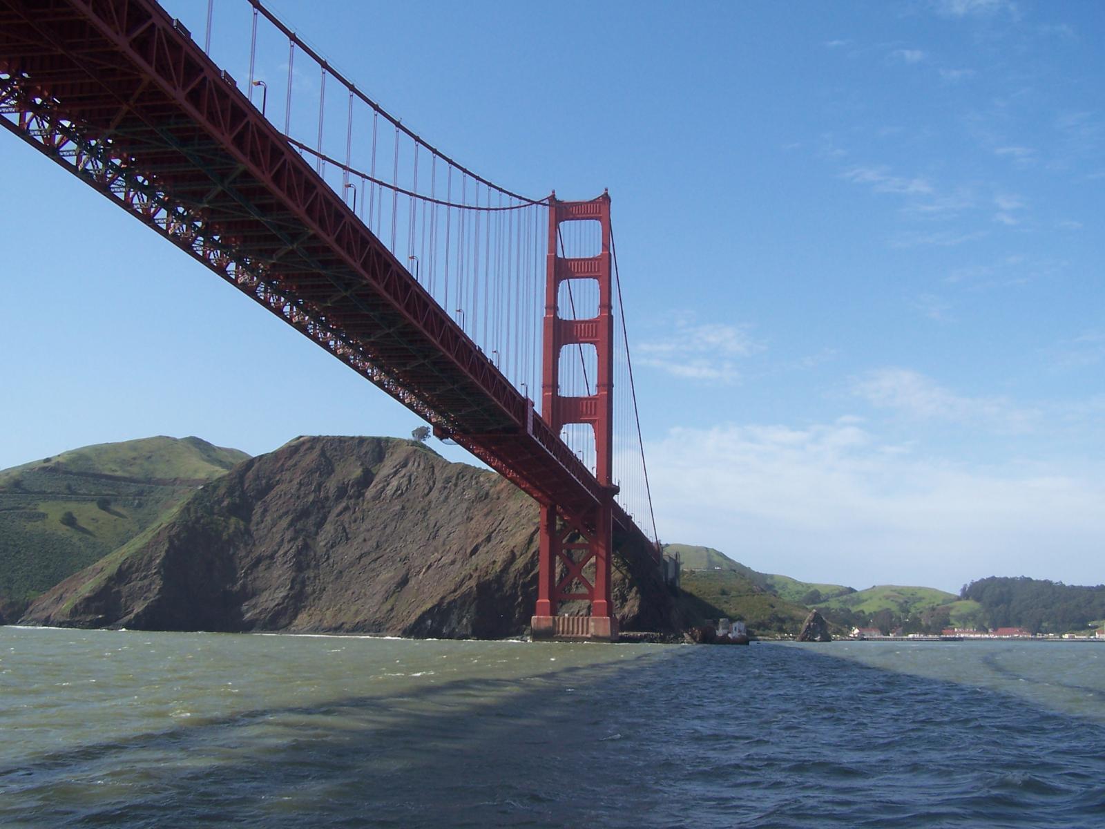
And now for a massively large image. It also has no alignment.
The image above, though 1200px wide, should not overflow the content area. It should remain contained with no visible disruption to the flow of content.
And now we’re going to shift things to the right align. Again, there should be plenty of room above, below, and to the left of the image. Just look at him there… Hey guy! Way to rock that right side. I don’t care what the left aligned image says, you look great. Don’t let anyone else tell you differently.
In just a bit here, you should see the text start to wrap below the right aligned image and settle in nicely. There should still be plenty of room and everything should be sitting pretty. Yeah… Just like that. It never felt so good to be right.
And just when you thought we were done, we’re going to do them all over again with captions!
The image above happens to be centered. The caption also has a link in it, just to see if it does anything funky.
Itty-bitty caption.
The rest of this paragraph is filler for the sake of seeing the text wrap around the 150×150 image, which is left aligned.
As you can see the should be some space above, below, and to the right of the image. The text should not be creeping on the image. Creeping is just not right. Images need breathing room too. Let them speak like you words. Let them do their jobs without any hassle from the text. In about one more sentence here, we’ll see that the text moves from the right of the image down below the image in seamless transition. Again, letting the do it’s thang. Mission accomplished!
And now for a massively large image. It also has no alignment.
Massive image comment for your eyeballs.
The image above, though 1200px wide, should not overflow the content area. It should remain contained with no visible disruption to the flow of content.
Feels good to be right all the time.
And now we’re going to shift things to the right align. Again, there should be plenty of room above, below, and to the left of the image. Just look at him there… Hey guy! Way to rock that right side. I don’t care what the left aligned image says, you look great. Don’t let anyone else tell you differently.
In just a bit here, you should see the text start to wrap below the right aligned image and settle in nicely. There should still be plenty of room and everything should be sitting pretty. Yeah… Just like that. It never felt so good to be right.
Imagine that we would find a use for the extra wide image! This image has the wide width alignment:
Can we go bigger? This image has the full width alignment:
And that’s a wrap, yo! You survived the tumultuous waters of alignment. Image alignment achievement unlocked! One last thing: The last item in this post’s content is a thumbnail floated right. Make sure any elements after the content are clearing properly.
The Common category includes the following blocks: Paragraph, image, headings, list, gallery, quote, audio, cover, video.
The paragraph block is the default block type. It should not have any alignment of any kind. It should just flow like you would normally expect. Nothing fancy. Just straight up text, free flowing, with love.
This paragraph is left aligned.
This italic paragraph is right aligned.
Neither of these paragraphs care about politics, but this one is bold, medium sized and has a drop cap.
This paragraph is centered.
This paragraph prefers Jazz over Justin Timberlake. It also uses the small font size.
This paragraph has something important to say: It has a large font size, which defaults to 36px.
The huge text size defaults to 46px, but the size can be customized.
This paragraph is colorful, with a red background and white text. Colored blocks should have a high enough contrast, so that the text is readable.
Welcome to image alignment! The best way to demonstrate the ebb and flow of the various image positioning options is to nestle them snuggly among an ocean of words. Grab a paddle and let’s get started.
On the topic of alignment, it should be noted that users can choose from the options of None, Left, Right, and Center. In addition, they also get the options of Thumbnail, Medium, Large & Fullsize. Be sure to try this page in RTL mode and it should look the same as LTR.
The image above happens to be centered.
The rest of this paragraph is filler for the sake of seeing the text wrap around the 150×150 image, which is left aligned.
As you can see the should be some space above, below, and to the right of the image. The text should not be creeping on the image. Creeping is just not right. Images need breathing room too. Let them speak like you words. Let them do their jobs without any hassle from the text. In about one more sentence here, we’ll see that the text moves from the right of the image down below the image in seamless transition. Again, letting the do it’s thang. Mission accomplished!
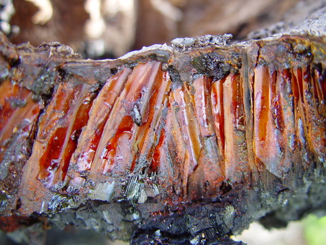
And now for a massively large image. It also has no alignment.
The image above, though 1200px wide, should not overflow the content area. It should remain contained with no visible disruption to the flow of content.
And we try the large image again, with the center alignment since that sometimes is a problem. The image above, though 1200px wide, should not overflow the content area. It should remain contained with no visible disruption to the flow of content.
And now we’re going to shift things to the right align. Again, there should be plenty of room above, below, and to the left of the image. Just look at him there… Hey guy! Way to rock that right side. I don’t care what the left aligned image says, you look great. Don’t let anyone else tell you differently.
In just a bit here, you should see the text start to wrap below the right aligned image and settle in nicely. There should still be plenty of room and everything should be sitting pretty. Yeah… Just like that. It never felt so good to be right.
And just when you thought we were done, we’re going to do them all over again with captions!
The image above happens to be centered. The caption also has a link in it, just to see if it does anything funky.
Bigger caption than the image usually is.
The rest of this paragraph is filler for the sake of seeing the text wrap around the 150×150 image, which is left aligned.
As you can see the should be some space above, below, and to the right of the image. The text should not be creeping on the image. Creeping is just not right. Images need breathing room too. Let them speak like you words. Let them do their jobs without any hassle from the text. In about one more sentence here, we’ll see that the text moves from the right of the image down below the image in seamless transition. Again, letting the do it’s thang. Mission accomplished!
And now for a massively large image. It also has no alignment.
Comment for massive image for your eyeballs.
The image above, though 1200px wide, should not overflow the content area. It should remain contained with no visible disruption to the flow of content. This massive image is centered.
And again with the big image centered. The image above, though 1200px wide, should not overflow the content area. It should remain contained with no visible disruption to the flow of content.
Feels good to be right all the time.
And now we’re going to shift things to the right align. Again, there should be plenty of room above, below, and to the left of the image. Just look at him there… Hey guy! Way to rock that right side. I don’t care what the left aligned image says, you look great. Don’t let anyone else tell you differently.
In just a bit here, you should see the text start to wrap below the right aligned image and settle in nicely. There should still be plenty of room and everything should be sitting pretty. Yeah… Just like that. It never felt so good to be right.
And that’s a wrap, yo! You survived the tumultuous waters of alignment. Image alignment achievement unlocked! One last thing: The last item in this post’s content is a thumbnail floated right. Make sure any elements after the content are clearing properly.